Create or Configure a Form
Introduction
A form allows you to collect and store information provided by your website's users. For example, a contact form can record and store an individual user's contact details.
Sitekit allows you to create and edit many individual Form Pages. Form Pages can be configured as either:
- A page that is dedicated to a single form and does not contain any editorial text or other functions, or
- An editorial page which has one or more forms written into the code of the page. Contact your administrator for information on editing these forms.
This Help Topic deals with the former case, where a page is dedicated to a single form. The form markup has been substantially revised for 10.3 please click for details
There are four types of reserved forms which are automatically created and appear in the form configuration table at the bottom with an asterisk * alongside. They are used to configure and customise the login forms in use for accessing intranets and extranets
Creating a Form
- Click Forms in the Configure tab.
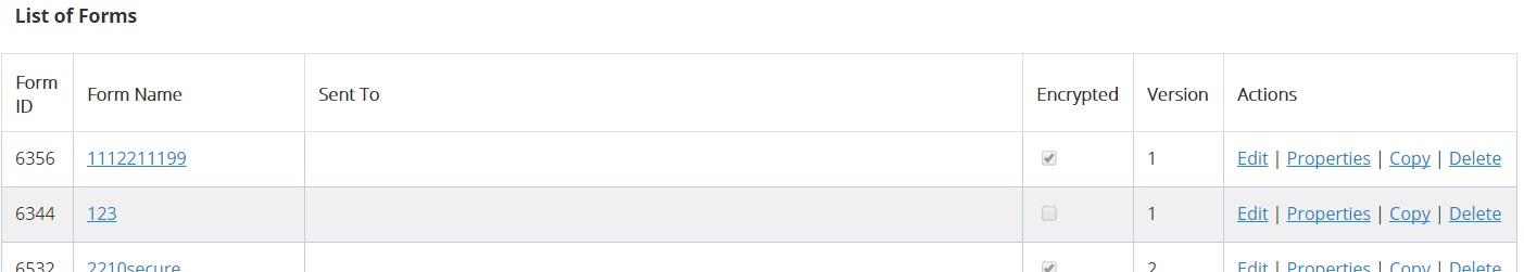
- A list of all the forms on your site is now displayed. Right at the bottom of this list you’ll see three empty fields, next to a command labeled Add.
- In the first field enter the Name of your new Form into the first field.
- In the second field enter the email address of the person who will receive notification of new form submissions.
- The third field is ticked if you want the form to be a Sitekit Secure Form (heavily encrypted), or left empty if you want to use a normal form.
- The form type or version is read only in the fourth field, it defaults to the highest version for new form but can be edited by editing form properties later. See advanced section below.
- Click the Add command. A new empty form is now created, and will be added into the list of forms, which are shown in alphabetical order.
- Having created a new blank form, you now have to design the contents, as described in the Configuring a Form section, described next.
Populating the form with fields
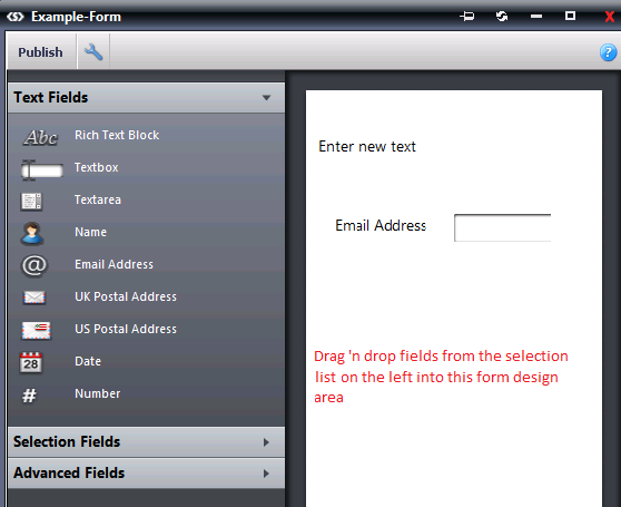
- Glance down the list of existing forms, find the one you want, and click the Edit action alongside its name.
- The Form Builder popup screen now opens. On the left of the screen you will see three tabs, labeled Text Fields, Selection Fields, and Advanced Fields.
- Each of these tabs contains a number of field objects – Textboxes, Date Fields, Checkboxes and so on. You create your form by clicking your mouse button on a field object, then dragging and dropping it onto the blank form. (Double-clicking on a field will add it to the form as well).
When you have dropped a field object onto the form, you’ll see that when you run your mouse over it, three small icons appear next to the field, shown and described below.
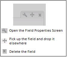
The x icon is used to delete a field, and the + icon is used to pick it up and drop it somewhere else in the form. The Spanner icon is used to define the field properties.
When you’ve dropped a field onto the form, click the Spanner icon to open the field Properties popup menu. This menu varies from one field type to another, since each of the thirty three field types contains their own properties. But nearly all of them contain the basic properties described below.
Name: This is the name of the field, which Admin staff will see when they view submitted data.
Label: This is the text label that appears alongside the field when a visitor to the site looks at your form.
Default Value: Allows you to enter a default value for the field. For example you could use it to default a “agree to receive annoying emails for life” Yes/No button to Yes.
Mandatory: When you check the Mandatory box, a site visitor can not submit a form until all the mandatory fields have been filled in. If a mandatory field is left blank, the visitor will receive an error message informing them of their omission.
The full list of Field Types contains descriptions of their individual properties.
When you have finished designing your form, click the Publish button on the top left of the popup screen, to save your work. (You’ll get a warning message if you try to close the screen without saving your work).
Geographical Location Field
New in v 9.4 is the ability to enter a geographical location field into a form via google.map plug-in. As of 10.4 you no longer need to add these script to your page, the form will automatically include them from the script manager. The two scripts should be placed in the Script Code Area (in the Advanced tab of Page properties).
|
<script type="text/javascript" |
|
|
<script type="text/javascript" |
Copying Fields
For version 2 and 3 forms, you can copy fields within forms, or between forms, as follows:
- Right-click on the field.
- Select 'copy'.
- Mouse over the field in the form where you want to position the copy.
- Right-click.
- Select 'paste'.
- The copied field will be inserted at that position in the form.
Setting the Form Properties
Now that you’ve populated the form with all the fields you want it to contain, you have to set the Form Properties. Click on the Properties action alongside the name of the form you want to work on, and the Form properties popup screen will open. This screen allows you to define about twenty properties, grouped under five Headings, as described below.
General properties
- Form name - Name of form, this will be displayed on the web page at the top of the form.
- Required field text - Text that will appear next to any mandatory fields. NB: as of 11.2.2 the live page wraps this in a span with the class SKFormRequiredFieldText.
- Submit button text - Text that appears on the submission button.
- Asset class - the asset class applied to the from in order to control access
- Use Invisible reCaptcha - checkbox. reCaptcha is a Google service that limits robotic access to forms. Ticking this box in conjunction with having the relevant API keys set in site settings will reduce robotic spamming of forms (added in 11.1) InvisiblereCaptcha is always on by default and will warn about needing to enter API keys when publishing the form properties if keys are missing. When keys are present and the form has it enabled then front-end will automatically applyreCaptcha to that form.
- If you also want to apply your own script validation with reCaptcha then you can listen for the javascript event 'recaptchaSubmit' that will be triggered after recaptcha has validated the user but before the form is submitted. (12.0)
- Allow Auto Complete (11.2)
When unchecked, the front-end markup has the autocomplete="off" attribute inserted into its FORM tag.
When checked the autocomplete attribute is not added to the form tag. - Aggregate Results (for Polls) - Results from dropdowns, option groups and checkbox elemnts are added up and can be graphed via an associated web service. Changing this checkbox will reset the results to zero.
- Markup as DIVs (Not TABLEs) - Allows you a choice of HTML formatting. Normally DIVs are recommended for accesibility.
- Submit to a web-service or other external URL - allows form data to be submitted to a web-service or other third party URL, as well as being logged in Sitekit. If you check this box, you'll be asked to fill in External Form Submission Data, consisting of the external URL, and a successful response string.
Clearing an Aggregate Result
To clear an existing aggregate result, to make way for a new aggregate result, take the following steps.
- Configure the form, and uncheck the aggregate box.
- Save the form.
- Configure the form, and check the aggregate box.
- Save the form.
This will clear the old aggregate, so that new form submissions will start incremementing a new aggregate from scratch.
After Form Submission
- Redirect to another Page = Check this box and you're promted to enter the page to redirect to. The Asset Picker opens to help you locate the right page.
- Show a Message - optionally you can define a message which appears after a successful form submission. When you check this box, a message area opens into which you can type your message.
Auto-Response email
After a visitor has submitted a form you can opt to have them receive a confirmation email. The options below allow you to format that auto-response email:
- Plain Text Auto-Response Email - Leave blank to use the default. You can insert the content inserted into any of the form fields by wrapping their names in % symbols, e.g. %Name%. %submissionid% can also be used to insert the form submission's unique ID number. [Updated in v11.1 for security reasons] Any HTML e.g. links that are submitted in the form will now be stripped out.
- URL or HTML Auto-response email - allows you to enter the web address of a page to be used for this email.
- Email Subject - leave blank to use the default value, otherwise type in a subject.
- Email Sender Name - leave blank to use the default, otherwise type in another name.
- Reply to email Address - leave blank to use the default value - abyss@sitekit.net.
Email Address Verification
- Require Email verification - If you check this box the submitter is required to verify their email address by clicking a link in the autoResponse email (this only applies if the form contains an "Email Reply to" element).
- Starting in 11.3 notifications will not be sent to email recipients or web-services until the submitter actually confirms their email reducing the number of spam notifications.
If you check this option you're prompted to enter a Confirmation Page. The asset picker opens to help you locate the appropriate page.
Notification Email
- Send Notification Email to - Type in the email address to which notification emails should be sent. You can select multiple addresses, if you like, by separating them with commas. This field accepts regular expressions (regex) so you can create a pattern to limit the domain say of accepted emails (added in 11.1)
- Copy Notification Email to - You can copy a notification email to another address, if desired. As with Notification Emails, you can enter several email addresses, separating them with commas.
- Notification Email Subject - Leave blank to use the default. You can insert the content inserted into any of the form fields by wrapping their names in % symbols, e.g. %Name%. %submissionid% can also be used to insert the form submission's unique ID number. [Updated in v11.1 for security reasons] Any HTML e.g. links that are submitted in the form will now be stripped out.
- Send Notification Email From Submitter - Checking this option results in the notification email appearing to have been sent by the email address the submitter has entered into the Email (Reply To) field. If unchecked, the notification Email will appear to have come from the server's default outgoing email address. This field also accept regular expressions (regex) so you can create a pattern to limit the domain say of accepted emails (added in 11.1)
- Send Notification Email as HTML - Check to send notification emails in HTML.
Form type 3 submissions are not sent as part of the notification email, instead the administrator is notified by email but they will need to log into the admin system to see the submission. Added in 11.0
Mailing Lists
- This section displays a list of all the mailing lists on your site. Just check the boxes of whichever mailing Lists you want to place on the form. Visitors can subscribe to any (or all) of the selected mailing lists.
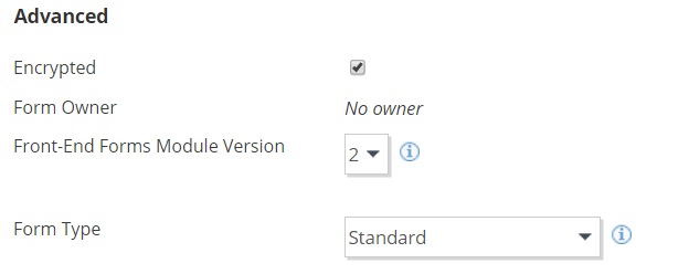
Advanced
This section outlines advanced configuration of the form, specifically the form type:
- encrypted - checkbox indicating whether the form is encrypted
- Form owner - read only, the form owner
- Front-End Forms Module Version or type - In 10.3 themarkup output by forms was radically changed.Theoldermarkup isretainedforpreviouslycreatedformsandthenewmarkup used by default for all new creations. You should always use the the highest version number you can.Thissettingallowssiteeditorstoupdateexistingformstousethenewmarkup, though changes to the appearance of their forms may make changestostylesheets necessary.
- Type 1 - original form with oldest markup, no longer compliant with current browsers
- Type 2 - revised form type with cleaner reduced markup and HTML5 support, type 2 also supports some new fields. Includes custom forms for logins below
- Type 3 - same markup as type 2 , supporting forms into posts system. Increased security regarding form notifications, form owner needs to login to retrieve submission. Added in 11.0
- Form type - Only show for type 2, used to create custom authentication forms for different sections of your site.