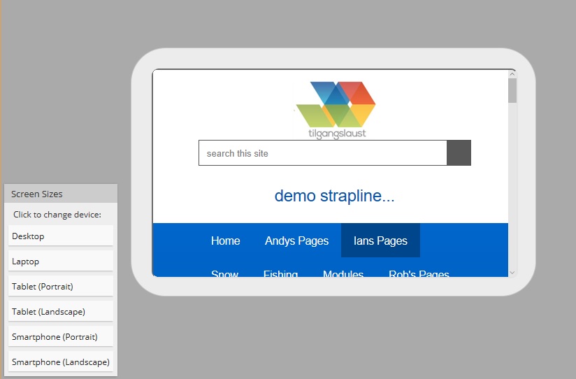
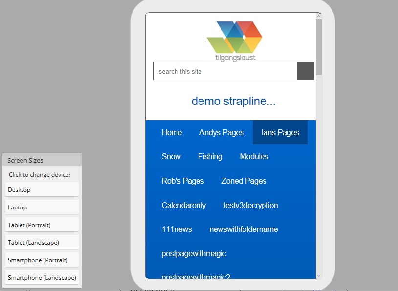
Page Preview
The page preview facility was added in 11 and is accessible from the editing pane and from the right click navigation menu. It uses Iframes to display a representation of the current page in different screen resolution so the editor can gauge how well the page reacts responsively.
The 'breakpoints' used to define the display transition point are listed below. These are chosen to provide a representative mix of the various platforms.
- Desk top - 100%
- Laptop - 1366 x 768 px
- Tablet (portrait) - 769 x 929 px
- Tablet (landscape) - 1024 x 675 px
- SmartPhone (portrait) - 320 x 504 px
- SmartPhone (landscape) - 480 x 256 px
The representation of the different screen sizes will obviously also be dependent on the screen resolution your using to administrate the site.