Form Fields
Sitekit provides a comprehensive choice of form field types that can be used in any combination to create forms to suit most purposes. This section describes the available field types. It's possible to make form field readonly by setting a checkbox in the readonly field (added in 11.1). A read-only input field cannot be modified (however, a user can tab to it, highlight it, and copy the text from it). The readonly attribute can be set to keep a user from changing the value until some other conditions have been met (like selecting a checkbox, etc.). Then, a JavaScript can remove the readonly value, and make the input field editable. It's only applicable to the fields labelled below.
The form markup has been substantially revised for 10.3
| Field Type | Function |
| Captcha | A captcha field displays an image of random text and asks the user to type what they see into a box. It is designed to stop a form from being used to distribute automated spam. Note Captcha fields may be inaccessible to the visually impaired. |
| Mathematical captcha | Displays a simple textual arithmetic question which the user has to answer. It is again designed to stop a form from being used to distribute automated spam. (10.2) This type of captcha is more accessible as the question is translated by text to speech browsers. |
| Checkbox | A single checkbox, providing the user with an 'either/or' choice. |
| Checkbox Group | A row of checkboxes giving the user the opportunity to make more than one choice from a list. The group's orientation is selectable to either Vertical or Horizontal. |
| Country List | A drop-down list of all the countries in the world. |
| Date | A box for the user to enter a date in the following format: dd/mm/yyyy. This produces a pop-up date picker when the form is displayed on the site (10.2). Supports readonly |
| Dropdown | A box containing a list of options for the user to select. By selecting the 'Single' Selection Mode you limit the user to one selection. By choosing the 'Multiple' mode you allow the visitor to select several choices. You provide the list of choices by typing in a comma-separated list. |
| Email Address Listbox | A field in which the user can enter one or more email addresses to which copies of the form data will be sent. |
| Email Address | A text box in which the user types an email address. The field is configured so that the form cannot be sent unless an email address in the correct format is entered in this box. If you check the 'Use as Reply to" box, the server will send an automated email confirming receipt of the form to this address. You can only have one "Use as Reply to" box ticked. If you tick this box on a second Email Address field, then the 'use as Reply to' box on this first field will be automatically unchecked. Supports readonly. This field accepts regular expressions (regex) so you can create a pattern to limit the domain say of accepted emails (added in 11.1). Email regex is applied whether the field is mandatory or not. If mandatory the field must not be empty and must match the regex. If NOT mandatory, the field can either be blank or must contain something matching the regex |
| Telephone | Outputs a field with an HTML5 type of 'tel'. Available only for new forms or where form type is set to 2 in form properties. Note this will change the markup so may affect the appearance if changed for existing sites. Added in 10.3. Supports readonly |
| Rich Textbox | Outputs a rich text editable block so that user can enter formatted text . Available only for new forms or where form type is set to 2 in form properties. Note this will change the markup so may affect the appearance if changed for existing sites. Added in 10.3 |
| URL | Outputs a field with an HTML5 type of 'url', supporting browsers may validate that this is a valid URL. Available only for new forms or where form type is set to 2 in form properties. Note this will change the markup so may affect the appearance if changed for existing sites. Added in 10.3. Supports readonly. Only valid URL will be accepted. |
| Time | Outputs a field with an HTML5 type of 'time'. Available only for new forms or where form type is set to 2 in form properties. Note this will change the markup so may affect the appearance if changed for existing sites. Added in 10.3. Supports readonly |
| Slider | Outputs a field with an HTML5 type of 'range', supporting browsers may represent this as a draggable slider between your specified ranges. Available only for new forms or where form type is set to 2 in form properties. Note this will change the markup so may affect the appearance if changed for existing sites. Added in 10.3 |
| Fieldset | A border with a header label that encloses a set of form fields. This is useful for grouping related fields to make it easier for the user to work their way through the form. A fieldset encloses all the form fields that appear below it in the list of fields, unless the fieldset is closed by one of the following means:
|
| Attachments | A button that allows the user to attach files to an email that is being sent via the form. Produces a styled popup. (Deprecated in 10.1) |
| Single file upload | An option to upload a single file to the site. Files attached via this method are not passed through to any associated web services. |
| Multi file uploads | An option to upload multiple files to the site. Files attached via this method are passed through to any associated web services. (Added in 10.1). Uploads from the above three fields are visible in admin and are attached in any emails to the form owner however they do not appear in the asset tree. The only way to add form attachments to a folder currently is by passing the submitted form data to the createposts web service which support a folder shortcutID as an argument. |
| Hidden Field | A line of text that is not visible on the form on the website but is included in the data that is sent to the server when the form is submitted by the user. Hidden fields are useful for identifying the purpose of a form. For example, if several identical forms on a website are used to collect different sets of data, each form can include a different hidden field, which can later be used to identify the different data sets. |
| Location (Lat/Long) | A geographical locationfield. See the full description of this field type further down the page. |
| Name | Only use one Name field per form. It's designed to hold the name of the form submitter - so having more than one would be confusing. If you need to enter more ''names" - define them as text fields. Supports readonly |
| Number | A box into which the user can type a number. Supports readonly |
| Option Group | A row of 'radio' buttons giving the user the opportunity to make one choice from a list of options. You define the buttons by typing in a list of comma separated values. The buttons can be displayed either vertically or Horizontally, by selecting the appropriate Orientation. |
| Page break | Adds a 'next' button to the form allowing the form to continue onto another page. Data collected on the current page is carried forward and submitted when all pages of the form are completed. |
| Password | Adds a password box to the form. When the user types a password the letters and numbers are replaced by asterisks to keep the password secret from onlookers. Supports readonly |
| Rich Text Block | Allows you to type in a block of useful explanation relating to the form. You can format this text block as desired. (Prior to v9.4 this used to be called "Label", and had to be styled separately). |
| Text area | Adds a box (with a scrollbar) to the form in which the user can type multiple lines of text. Supports readonly |
| Text box | Adds a box to the form in which the user can type a single line of text. If you click the Mandatory box, you are prompted to enter Validation criteria. Choices are: Alphabetic, Alphanumeric, Date-Format, Numeric, or Custom.. If you select Custom then you are prompted to enter a regular expression. For example, if you want the user to enter a web address (URL) into the form you can configure a custom validation text box to ensure that the web address is entered in the correct format (e.g. http://www.yourdomain.com). The user will be unable to send the form if the web address that they have typed doesn't match the specified format. Supports readonly |
| UK Postal Address | Creates a set of form fields as follows:
|
| US Postal Address | Creates a set of form fields as follows:
|
| XML source | Takes form input features from any third party source and adds it to the form. For example, a drop-down list that has been configured in a form on another website can be imported into this form. Alternatively a large single or multiselect option can be derived from an uploaded excel spreadsheet. The name and ID values for the generated input field must match the 'name' field configured for that form. The XML source field support eXSLT(added in 10.5) as well as XSL |
| Confirm | The confirm field (added in 11.3) allows you to ask a user to confirm the value they have entered into a previous field ie when entering a password |
Location (Lat/Long)
Introduced in v 9.4, the Location field allows you to add a geographical location field into a form via a google.map plug-in. This can be used in a number of ways. For example, you can invite visitors to enter their location, allowing you to analyse geographic demographics.
Visitors can enter their location in a number of ways - a Town Name or a Post Ciode, for example, and the plug-in will convert this into a Latitude and Longtitude, which are submitted along with the other form data.
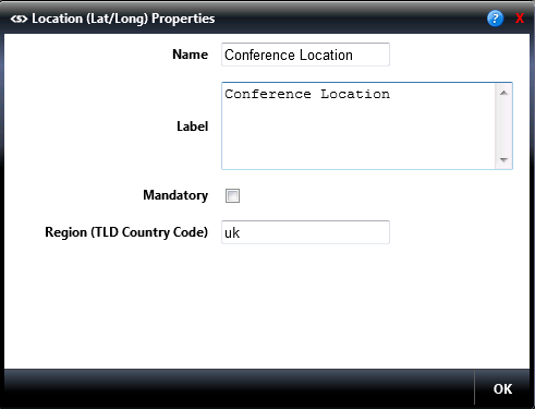
The Region (TLD Country Code) refers to the Top Level Domain Name. It defaults to UK, but you can select other TLDs if needed - for example, US is the TLD for the USA.
From version 10.2 onwards no additional script needs added to the page for this, the script manager will handle it automatically.