Stylesheets
CSS Style Sheets are applied to every page on your site. They can be applied on a page-by-page basis, or inherited from a parent page, but are usually applied site-wide in Site Settings. Your site may only require one CSS Style Sheet. Advanced options for Style Sheets allow you to add a print Style Sheet that is attached to a parent Style Sheet, and will apply when a page is printed using the :::printthispage::: system variable link. Secondary Style Sheets may be included for alternative page styles and colours etc.
Sitekit CMS Style Sheets are essentially the same as standard CSS used throughout the web and do not use any proprietary code as such. They will also include styles for Sitekit CMS modules which provide classes to facilitate styling.

Stylesheets are used to define common graphical elements - fonts, colours, divisions, and so on - for a range of pages.
Actions relating to Stylesheets include:
- Create a New Stylesheet
- Edit a Stylesheet
- Rename a Stylesheet
- Delete a Stylesheet
- Selecting Templates for Page Preview
Alternate Stylesheets
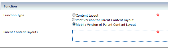
Alternate stylesheets can be triggered in specific instances, enabling tailored output for print or mobile devices. These alternate stylesheets are are set up as secondary browser options for existing stylesheets via radio buttons in the 'properties' tab.
In the case of printers, an alternate stylesheet is triggered by placing a :::printthispage::: magic word on the site that invokes the alternate print stylesheets for the page in question.
In the case of mobile devices, an alternate stylesheet is triggered by the automatic detection of the letters 'mobi' in the user agent string.
When a stylesheet or CSS file is published, a minified version is created. Added in 11.1
When designing stylesheets for mobile devices, you can use the magicword :::mobileswitch::: which allows a visitor to toggle between mobile and desktop stylesheets.